Introducing a New Look, Reflecting Our Unified Approach
September 26, 2019
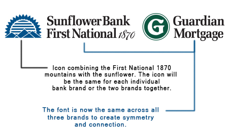
Working together as Sunflower Bank, First National 1870, and Guardian Mortgage, we proudly provide financial solutions to the communities we serve. As we strengthen and grow as an organization, we are pleased to more closely align our brand identity. Our new refined logos recognize our unity and honor the brand elements that make us distinct in our markets, but also symbolize that we are a stronger whole.
 Going forward, the combined sunflower and mountain icon will be used in all bank markets as part of the logo for Sunflower Bank and First National 1870. The combined icon previously used for dual-branded bank services received an overwhelmingly positive response. It has now been transformed to a cohesive version that is a clean, modern representation of where we are today: a rising organization that spans a wide footprint with a deep roots in our geographies. In addition, we have adopted a consistent font across all three brands to create symmetry and connection. This straightforward, easy-to-read font reflects our mission to be a bank that simplifies and supports.
The new look is meaningful, but also subtle and our approach is to slowly make the shift to avoid disruption. You will begin to see the new logos in many applications, while others will continue to feature the old logo for a period of time. We hope you enjoy the new look and appreciate the more unified feel it represents.
